When exploring data using The Gamma, you are doing two things at the same time:
-
Writing reproducible script. As you work with data, you are writing a program or a script that describes several data transformations and an action to do once the data is transformed (like creating a chart). This means that you can always run the script on the original data source, but also modify the script later (without redoing all the work from scratch) or even choose a different data source.
-
Manipulating data. At the same time, you are manipulating data directly as you would do in a spreadsheet application. The live preview lets you see the data at the current stage of the transformation, you can modify parameters of the transformation, add a new transformation and so on.
The typical way of using The Gamma is to combine the two. Some of the features (like creating and configuring charts) require writing code, but most of the data transformation can be done by using the live preview. Then you can check the code to make sure that the transformations sound right!
Writing reproducible scripts
Writing scripts in The Gamma is easier than you might think. You do not need to be a programmer to use it, because the language is very simple and the editor helps you by offering the available options at each step. The following example shows the typical process of writing a data transformation. Here, we want to build a pie chart showing from which Olympic games got Michael Phelps his Gold medals:
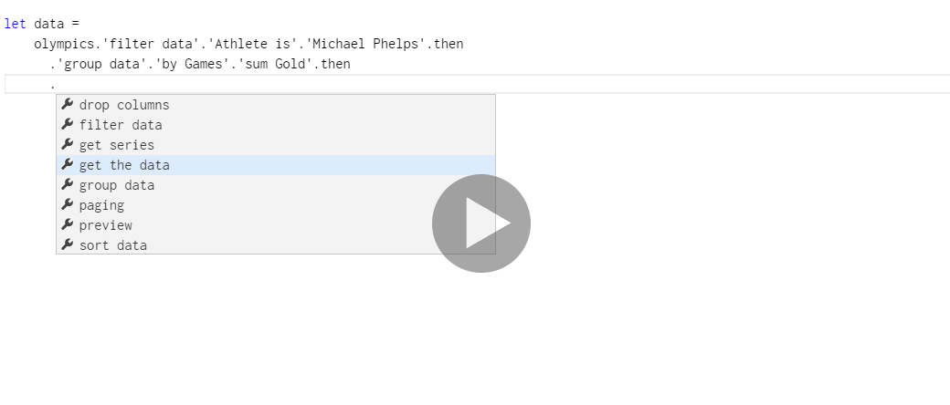
We start by writing let which defines a new name data that will contain the result of the
data transformation (you can use any name you wish). Then we write the sequence of transformation
itself starting with olympics which is our primary data source.
As you write the transformations, you can use the auto-completion list which offers available
members. At the first level, it gives you a number of transformations - once you choose a
transformation, you can specify various parameters that it needs. At the end, you typically need
to choose the then option, which means that you specified all the parameters you wanted.
The available transformations are:
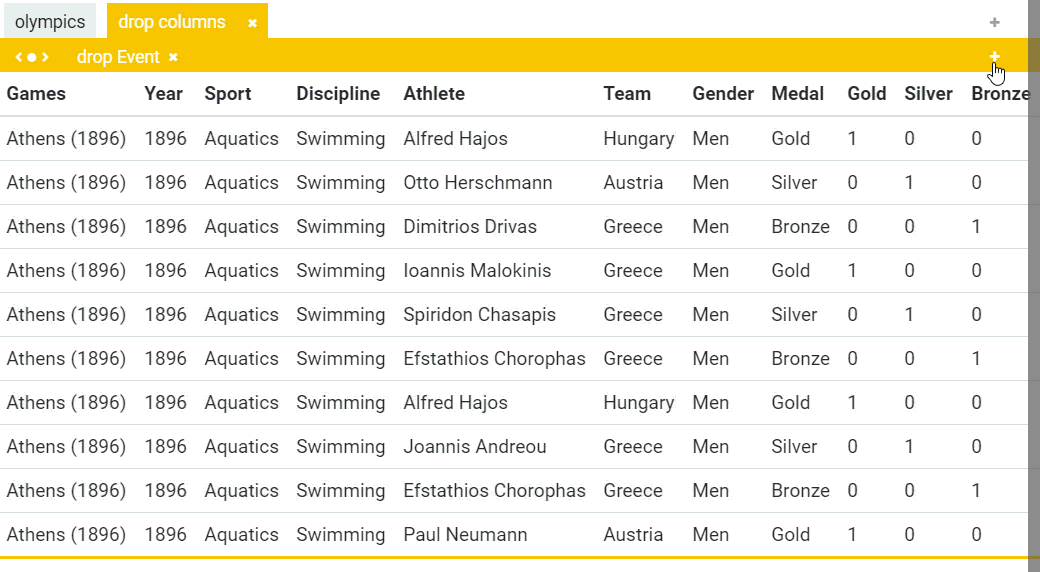
drop columnslets you drop one or more columns from the original data set, so that they do not clutter the resulting table. Choose the columns you want to drop and then end the operation withthen.filter datalets you remove some of the rows from the data set based on given conditions. You can specify that value of a column should or should not be a certain value and you can apply multiple conditions; end the list of conditions withthen.sort datalets you specify one or more sorting keys, using ascending (small to large) or descending (large to small) order. When specifying multiple columns, later columns are used when the value of the earlier columns is the same - for example use Gold medals first and Silver medals when the number of Gold medals is the same.pagingcontains two operations namedtakeandskipthat you can use to get data by pages (take the first 10 items to get the first page; skip 10 and take the next 10 items to get the second page and so on). Those are functions and so they are called using parentheses.get seriescan be used at the end to get a series of data - a series maps keys (e.g. athlete names) to values (e.g. number of medals) and can be passed to charting functions.get the datareturns data table with all the data after the transformation. You can use this if you want to create a table with the results.
In the above demo, we finish the visualization by creating a pie chart using chart.pie(data).
There are two operations that you can do at the end of a script:
-
chart.pie,chart.columnand other functions underchartcan be used to draw various charts. Those take a data series, so make sure to end the transformation for getting the data usingget series. -
table.createcreates a table with all the data returned by the transformation. To use it, end your transformation withget the dataand then write something liketable.create(data).
Manipulating data in the editor
The other way of working with data is to use the live preview. Even though this feels more like editing data in a spreadsheet application, it does exactly the same thing as writing code - the editor also creates a reproducible transformation that you can apply to other data sources or modify later. In the editor, you can see both the code and the live preview side-by-side, but to make the following example clearer, it shows just the editor part.
In the example, we drop a couple of columns, group rows by team (country) and add a number of aggregations (sum the number of gold medals, count how many athletes they sent to Olympics and count how many Olympic games the team attended). As you can see, the UK was present at one more Olympic games than anyone else!
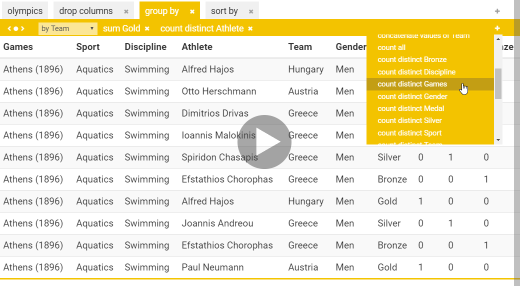
The user interface mirrors the operations that you can write in code. The tabs of the live preview represent individual transformations. You can navigate through them and see the values at the current stage of the transformation. You can add more transformations using the “+” on the right and remove them using the “x”.
Each of the transformations has different options, which are exposed in the yellow panel. For example, when sorting, you can add and remove sorting keys (again, using “+” on the right and “x” by the sorting keys). When grouping data, you can choose the key used for grouping and then you can add one or more aggregation that should be performed over the group.
Using further language features
The language used for writing The Gamma scripts is still work in progress, but the following two examples illustrate most of the features that you need to know about in order to use it to writing simple data aggregations and visualizations. The following example illustrates the data aggregation aspects using the pivot type provider:
let data =
  olympics
    .'filter data'.'Games is'.'Rio (2016)'.then
    .'group data'.'by Athlete'.'sum Gold'.then
    .'sort data'.'by Gold descending'.then
    .'paging'.take(8)

let athleteGold =
  data.'get series'.'with key Athlete'.'and value Gold'

let allData =
  data.'get the data'
The notable language features illustrated by the example are:
-
The
letkeyword is used to define new symbols that refer to the result of some transformation. You can also split the transformation into multiple steps by usingletmultiple times. -
You can access provided operations or members using
., which triggers the auto-completion. Members with names that contain spaces and other odd symbols can be quoted using'single quote'. -
When using
let, you can write long transformation across multiple lines, but make sure to have at least one space before the code that continues on further lines.
The following two examples illustrate the functions for drawing charts and creating tables. First, we can create and configure a column chart:
chart.column(athleteGold).legend(position="none")
  .set(colors=["#F4C300"], title="Top medalists")
The members that you see when you type . can be either properties or functions. Properties are
accessed just by typing their names, but functions take parameters and need to be explicitly
called using parentheses (...). Some functions also take optional parameters like the colors
and title parameters of the set function, which sets various properties of the chart.
The parameter specifying colors is a collection of colors and so we write ["#F4C300"] to create
collection with just one color (multiple colors would be used if you had multiple data in the
chart).
table.create(allData)
  .set(showKey=false, title="Medal summary for Rio 2016")
The second example creates a table and is a bit simpler - just like charts, you can configure
properties of the table using set. In this example showKey specifies that we do not want to
include the row number and title sets the name of the table.